


Power BI is a tool known for its ability to make data come alive, and one of its most exciting features is Field Parameters. Introduced relatively recently, field parameters empower report creators to offer users dynamic control over how data is visualised. Whether you’re switching between metrics like Revenue and Expenses or toggling dimensions like Region and Category, field parameters add a layer of interactivity that can make your dashboards feel truly intuitive. In this post, we’ll explore what field parameters are, how they work, and how you can start using them to create more engaging and versatile Power BI reports. By the end, you’ll have the tools you need to make your dashboards smarter and more user-friendly.
What Are Field Parameters?
Field parameters are one of Power BI’s more versatile features, allowing you to dynamically switch the fields or measures displayed in a visual. Imagine you’re analysing sales data and want to quickly toggle between metrics like Revenue, Expenses, and Profit or dimensions like Region, Product, and Customer Segment—field parameters make this possible without creating multiple visuals.
In simple terms, a field parameter acts as a selector. It lets users decide what they want to see on the fly, transforming static dashboards into dynamic and interactive experiences. Instead of cluttering your report with separate charts for each metric or dimension, you can use a single visual and let field parameters do the heavy lifting.
What makes this feature particularly brilliant is its simplicity. Once set up, it seamlessly integrates with slicers and dropdowns, making it easy for users to explore data their way. Whether you’re building a report for a team of analysts or creating a dashboard for senior leadership, field parameters allow you to deliver insights tailored to the audience’s needs.
Why Are Field Parameters Important?
Field parameters are a fundamental way to enhance your Power BI reports. They bring a host of benefits that elevate your dashboards, both in terms of functionality and user experience.
Enhanced Interactivity
One of the standout benefits of field parameters is the ability to make reports interactive. Users can switch between metrics or dimensions with just a click, allowing them to explore data in ways that are most relevant to their needs. This is particularly useful in scenarios where stakeholders have different priorities; for example, a sales manager might want to view revenue by region, while a finance lead prefers to see expenses by category. Field parameters cater to everyone.
Simplified Design
Before field parameters, developers often had to create duplicate visuals for every possible metric or dimension. Experienced developers might use bookmarks to alternate between these visuals. Now with field parameters, you can consolidate your visuals into a single, dynamic chart or table. This not only reduces clutter but also makes your report easier to maintain and navigate. It’s a win-win for both creators and users.
Scalability
As your data grows or your reporting needs evolve, field parameters offer a scalable solution. Adding new metrics or dimensions is as simple as updating the parameter, without requiring major changes to the report layout.
Improved User Experience
Field parameters put the power of exploration in the hands of the user. Instead of being presented with static data, users can interact with the report, drilling into the areas that matter most to them. This not only makes the experience more engaging but also helps users uncover insights they might have missed in a traditional report.
Field parameters are a powerful tool for creating dynamic, user-friendly reports that adapt to the needs of any audience.
How Field Parameters Work
Field parameters operate by leveraging a combination of Power BI’s DAX framework and its inherent flexibility in visuals. When you create a field parameter, Power BI generates a table that holds the fields or measures you want to toggle between. This table also includes a numerical reference field that helps Power BI keep track of which field or measure is currently selected.
The Mechanics of Field Parameters
Here’s a breakdown of how they work:
-
- The Parameter Table: When you create a field parameter, Power BI generates a DAX table. Each entry in this table corresponds to a field or measure you want to include. For example:
Field Parameter =
{
("Revenue", NAMEOF('Your Table'[Revenue]), 0),
("Expenses", NAMEOF('Your Table'[Expenses]), 1),
("Profit", NAMEOF('Your Table'[Profit]), 2)
}
The numbers at the end (0, 1, 2) are the numerical references that Power BI uses to link visuals to the parameter. - Integration with Slicers and Dropdowns: Once the parameter is created, you can drag it onto your report canvas and use it as a slicer or dropdown. This allows users to interact with the parameter and change the displayed fields or measures dynamically.
- Dynamic Visuals: When a user selects an option in the slicer, Power BI updates the visual to display the corresponding field or measure. This happens automatically, without the need for any manual intervention.
- The Parameter Table: When you create a field parameter, Power BI generates a DAX table. Each entry in this table corresponds to a field or measure you want to include. For example:
Why the Numerical Reference Field Matters
The numerical reference field is the backbone of field parameters. It ensures that each selection corresponds to the correct field or measure, enabling seamless switching between options. This becomes especially important when you’re working with linked parameters or more advanced setups.
By combining these mechanics with Power BI’s robust visualisation capabilities, field parameters allow you to create dynamic, interactive reports that adapt effortlessly to user input. In the next section, we’ll explore real-world examples of how this functionality can be applied.
Real-World Use Cases for Field Parameters
Field parameters are incredibly practical and can transform how you build reports. Let’s look at some scenarios where field parameters can make a real difference.
Financial Reporting
If you’re building a financial report that needs to show Revenue, Expenses, and Profit over time, instead of creating separate visuals for each metric, you can use a single visual with a field parameter. Users can then toggle between these metrics using a slicer, keeping the report clean and user-friendly.
Sales Analysis
Sales teams often need to slice data in multiple ways, such as by Region, Product, or Customer Segment. Field parameters allow you to build a single chart that dynamically updates based on the user’s selection, making it easier for sales teams to identify trends and insights without being overwhelmed by unnecessary visuals.
KPI Dashboards
Key Performance Indicator (KPI) dashboards are another area where field parameters are amazingly useful. You can create a dynamic card visual that lets users switch between metrics like Monthly Growth, Year-to-Date Sales, and Customer Retention Rate. This provides flexibility without sacrificing clarity.
In each of these examples, the common thread is simplicity and flexibility. Field parameters make it easier for users to focus on the data that matters most to them, all while reducing development and maintenance time for report creators. Next, we’ll walk through how to set them up step by step.
Step-by-Step Guide to Creating Field Parameters
Setting up field parameters in Power BI is a straightforward process, but it helps to have a clear roadmap to ensure you get the most out of this feature. Below, we’ll walk through how to create field parameters and integrate them into your reports step by step.
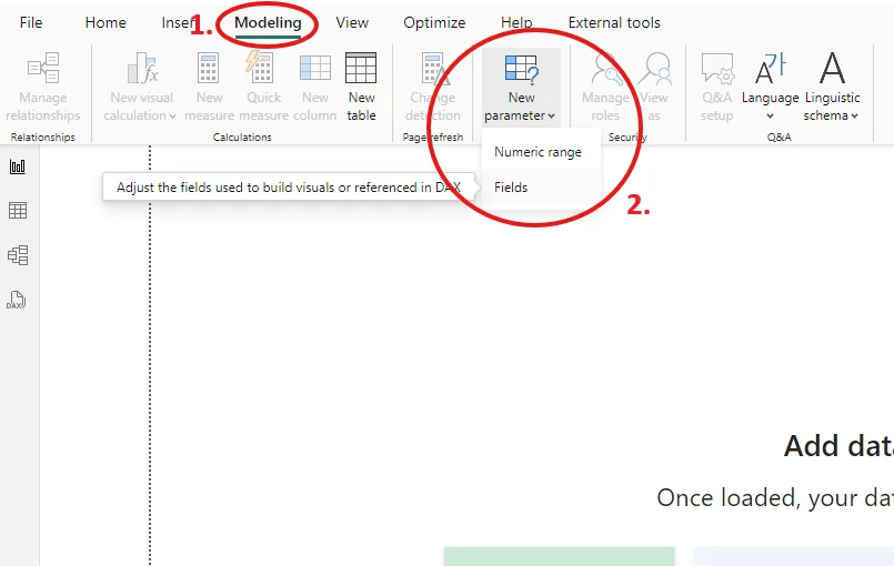
Step 1: Access the Field Parameters Feature
Field parameters are created in Power BI Desktop through the Modeling tab. Follow these steps to get started:
-
- Navigate to the Modeling tab in Power BI Desktop.
- Select New Parameter > Fields.
- This will open a dialog box where you can define the fields or measures to include in your parameter.
Step 2: Define the Fields or Measures
In the dialog box, you’ll see a list of available fields and measures from your data model.
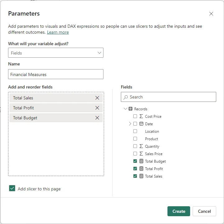
Choose the ones you want users to toggle between. For instance:
-
- If you’re building a financial report, you might include measures like Revenue, Expenses, and Profit.
-
- If it’s a sales analysis dashboard, you could include dimensions like Region, Product, and Customer Segment.
Once you’ve selected your fields or measures, Power BI will automatically generate a DAX table for your parameter.
Step 3: Review and Customise the DAX Table
Power BI creates a DAX table that defines the parameter. You can review and edit this table if needed. For example:
Field Parameter =
{
("Revenue", NAMEOF('Your Table'[Revenue]), 0),
("Expenses", NAMEOF('Your Table'[Expenses]), 1),
("Profit", NAMEOF('Your Table'[Profit]), 2)
}
The structure includes:
-
- Display Name: What users will see in the slicer or dropdown (e.g., “Revenue”).
-
- Field Reference: The actual measure or field in your data model (e.g.,
'Your Table'[Revenue]).
- Field Reference: The actual measure or field in your data model (e.g.,
-
- Numerical Reference: A unique number for each option (e.g., 0, 1, 2). Ensure these are consistent across related parameters if you plan to link them.
Step 4: Add the Parameter to Your Report
Now that your field parameter is ready, you can drag it onto your report canvas.
-
- Add the parameter to a Slicer or Dropdown visual. This will allow users to interact with it and choose the field or measure they want to view.
- Incorporate the parameter into your visuals, such as charts or tables, so they dynamically update based on the user’s selection.
Step 5: Test and Fine-Tune
Once your parameter is integrated into the report:
-
- Test the slicer or dropdown by selecting different options. Verify that the visuals update as expected.
- If something doesn’t work, check the DAX table for errors or mismatched references.
- Consider formatting the slicer or dropdown to make it visually appealing and easy to use.
Optional: Create Linked Parameters
For more advanced setups, you can create multiple linked parameters (e.g., Actuals, Targets, Forecasts) and use their numerical reference fields to establish relationships. This enables dynamic switching across multiple related visuals.
The Result
That’s it! With just a few steps, you’ve created a dynamic and interactive report that adapts to user input.
Conclusion
Field parameters allow Power BI developers to create smarter, more interactive reports that empower users to explore data in ways that are most meaningful to them. By incorporating field parameters into your dashboards, you’re not only enhancing functionality but also improving the user experience by allowing greater flexibility and control.
Getting Started
If you’re new to field parameters, start small. Experiment with creating a basic parameter to toggle between a few measures or dimensions. Test it in a slicer and observe how it enhances interactivity. Once you’re comfortable, explore advanced techniques like linking multiple parameters to create even more dynamic reports.
Don’t forget that the numerical reference field is your anchor—keeping your parameters in the same order ensures seamless interactions, especially when working with linked setups.
Field parameters are just one way Power BI is making data more accessible and engaging. Whether you’re building dashboards for your team, your clients, or yourself, mastering this feature will undoubtedly elevate your reports. So go ahead, give it a try—and let your data tell a more dynamic story.