12 Essential Keyboard Shortcuts for Writing DAX Code in Power BI

Introduction When I first started out with Power BI back in 2015, I could never work out how my colleague was getting his Power BI reports written so quickly and efficiently compared to me, until I stopped to watch him work. The difference? He’d mastered a handful of keyboard shortcuts that transformed his workflow and in turn, his productivity. After a decade of building Power BI solutions, I’ve come to appreciate how these small efficiency gains add up to massive time savings. When you’re writing DAX code day in and day out, knowing the right keyboard shortcuts isn’t just convenient—it’s essential for maintaining your own sanity! In this post, I’ll share my top 12 keyboard shortcuts that have saved me countless hours when writing DAX code. Whether you’re just starting out with Power BI or you’re looking to level up your DAX game, these shortcuts will make your life considerably easier. Why Keyboard Shortcuts Matter When Writing DAX Have you ever found yourself repetitively clicking through menus or struggling to navigate through complex formulas? That’s exactly where keyboard shortcuts come to the rescue. I’ve seen analysts who’ve mastered these shortcuts deliver reports in half the time compared to their colleagues (myself included). What’s more, they made fewer errors since their hands rarely left the keyboard. Now, let’s dive into the shortcuts that will transform your DAX coding experience! The 12 Most Useful Keyboard Shortcuts for DAX Code 1. Ctrl + Space: Auto-complete Suggestions What it does: Triggers the IntelliSense menu to show suggestions for functions, tables, and columns. Why it’s useful: This is the most useful shortcut for me (especially as a consultant that works on many different data models)! When I’m working with complex data models, I can’t possibly remember every table and column name. By typing the first few letters and hitting Ctrl + Space, I get a neat list of all matching options. Tip: If you’re unsure about a function name, type the first few letters and use this shortcut to see all relevant functions. 2. Alt + Up/Down Arrow: Move Lines Up or Down What it does: Moves the current line or selected lines up or down in your code. Why it’s useful: I use this constantly when reorganising complex DAX calculations. This shortcut helps me quickly restructure nested calculations without the cut-and-paste dance. Tip: Select multiple lines before using this shortcut to move entire blocks of code at once. 3. F1: Function Help What it does: Opens the documentation for the DAX function your cursor is currently positioned on. Why it’s useful: Even after years of writing DAX, I still need to double-check syntax or discover new parameters. I always emphasise using F1 instead of Googling functions—it’s faster and provides contextual help. Tip: Use this when exploring new functions to understand all available parameters and usage examples. 4. Ctrl + / : Comment/Uncomment Lines What it does: Comments out or uncomments the current line or selected lines. Why it’s useful: When troubleshooting complex calculations, I often need to test different approaches. Rather than deleting code I might need later, I comment it out. This shortcut has saved me hours of rewriting code during iterative development. Tip: Comment sections of your code to explain complex logic for future reference or for colleagues who might maintain your work. 5. Alt + Shift + Right Arrow: Expand Selection What it does: Gradually expands your selection outward from the cursor position. Why it’s useful: This one’s brilliant for selecting nested functions or specific parts of a formula without precise mouse movements. I discovered this whilst working on a particularly complex calculation, and it’s been part of my toolkit ever since. Tip: Continue pressing the shortcut to expand the selection further, encompassing increasingly larger portions of your code. 6. Ctrl + K, Ctrl + C: Comment Block What it does: Comments out a selected block of code. Why it’s useful: For longer sections of code that need commenting, this is more efficient than Ctrl + /. I use this when I’m exploring alternative approaches in complex models where I’ve written several calculation options. Tip: Pair this with Ctrl + K, Ctrl + U to uncomment blocks. 7. F2: Rename Variable What it does: When cursor is on a variable, this shortcut allows you to rename it throughout your code. Why it’s useful: Have you ever realised halfway through that your variable name is confusing or inconsistent? I certainly have! This shortcut helps me maintain naming conventions across hundreds of measures. Tip: Use descriptive variable names to make your code more readable—and when you need to change them, F2 is your best friend. 8. Ctrl + Shift + K: Delete Line What it does: Deletes the current line completely. Why it’s useful: Clean code is happy code! When I’m refining DAX measures, I often need to remove unnecessary lines quickly. This shortcut is much faster than selecting the entire line and then deleting it. Tip: If you accidentally delete a line, remember you can press Ctrl + Z to undo the action. 9. Shift + Enter: New Line Without Breaking Current Statement What it does: Inserts a line break without executing or breaking your current DAX statement. Why it’s useful: For readability, I like to format complex DAX calculations across multiple lines. This shortcut lets me do that whilst maintaining the integrity of the formula. I’ve trained all my team members to use this for better code organisation. Tip: Use this to break long formulas into logical chunks that are easier to understand and debug. 10. Ctrl + F: Find in Formula What it does: Opens the search function to find specific text within your DAX formula. Why it’s useful: When dealing with lengthy calculations, finding specific references or functions can be a needle-in-a-haystack situation. This helps me quickly locate all instances of a specific measure reference. Tip: Use Ctrl + H for find and replace functionality when you need to change multiple instances of the same text. 11. Ctrl
In-House vs Outsourced Power BI Development: Pros and Cons

I’ve spent the last decade helping businesses transform their data into actionable insights with Power BI, and if there’s one question I’m asked constantly, it’s this: “Should we build our own Power BI team or hire consultants?” It’s a brilliant question—and one with significant implications for your budget, timeline, and ultimate success with business intelligence. Let me walk you through everything I’ve learned from working with hundreds of clients across diverse industries. I’ll share what really works, what pitfalls to avoid, and how to make the best decision for your unique situation. The Power BI Revolution: Why Everyone’s Talking About It Power BI has completely transformed how we approach business intelligence. I remember when generating basic reports required an army of developers and weeks of work. Now, I can build interactive dashboards in hours that would have taken months in the old days. This accessibility has created a conundrum for many businesses: should you invest in building internal Power BI expertise, or partner with specialists who live and breathe this technology every day? What Does In-House Power BI Development Look Like? Building an in-house Power BI capability means assembling your own team of data professionals who understand your business from the inside. You’ll need: Data analysts who can translate business requirements into technical specifications BI developers skilled in DAX, Power Query, and data modelling Data engineers to handle complex ETL processes and data pipeline management Project managers to coordinate delivery and stakeholder communication I worked with a retail chain last year that invested heavily in building their internal Power BI team. The Finance Director told me, “We wanted people who understood our business down to the last SKU.” They hired three dedicated analysts and sent them for intensive Power BI training. The Perks of Building Your Own Power BI Team When you build your own team, you gain some significant advantages: Complete Control of Development Priorities I’ve noticed that my clients with internal teams can pivot quickly when business priorities change. Last month, one of my manufacturing clients needed to shift all their reporting focus to supply chain metrics overnight due to a major disruption. Their in-house team simply dropped everything else and redirected efforts—no contract negotiations, no scope discussions. Deep Integration with Business Processes Your own team will develop an intimate understanding of your business that’s hard for outsiders to match. They’ll know that the inventory numbers in System A are always overstated by 2% or that the CFO wants his regional breakdown in a very specific format. Long-term Cost Efficiency (Sometimes) If you have consistent, high-volume Power BI development needs, the economics can work in favour of in-house teams. I’ve calculated this for several clients, and the breakeven point typically comes after 18-24 months of steady development work. The Challenges You’ll Face Going In-House Building your own team isn’t all sunshine and rainbows. I’ve watched many businesses struggle with these hurdles: Significant Upfront Investment Have you seen the salary demands for experienced Power BI developers lately? They’re eye-watering. One of my clients in London budgeted £65,000 for a mid-level Power BI specialist, only to discover the market rate was closer to £85,000. Then there’s the cost of training, hardware, and the inevitable learning curve. Limited Expertise Breadth Here’s something I’ve observed repeatedly: in-house teams often develop tunnel vision. They become experts in the reports they build regularly but may lack experience with advanced techniques or emerging features. I visited a client last year who proudly showed me their Power BI solution. It was functional but relied entirely on direct queries against their database—no data modelling, no calculated columns, no time intelligence. They simply didn’t know what they didn’t know. Scaling Difficulties What happens when your CEO suddenly wants a complete overhaul of all executive dashboards by next quarter? Or when your Power BI guru accepts a job elsewhere? In-house teams often struggle with these capacity spikes and personnel changes. What Does Outsourced Power BI Consultancy Look Like? When you partner with a Power BI consultancy, you’re essentially renting expertise rather than building it. This typically takes one of several forms: Project-based engagements: Hiring consultants to deliver specific reports or dashboards Retainer arrangements: Ongoing access to Power BI expertise for a set number of hours monthly Hybrid models: Using consultants to augment your internal team during peak periods A logistics company I worked with last summer took the hybrid approach. They had two in-house analysts but brought our team in to handle a complex integration with their warehouse management system that required specialised ETL skills. Why Many of My Clients Choose Power BI Consulting I’ve seen businesses achieve remarkable results by partnering with Power BI specialists. Here’s why: Access to Diverse and Specialised Expertise When you hire a Power BI consultancy, you’re not getting one person’s knowledge—you’re tapping into a collective intelligence. Last month, my team was working on a challenging report for a healthcare provider. When we hit a roadblock with some complex DAX measures, I pulled in our DAX specialist who solved the problem in minutes. Dramatically Faster Implementation Have you ever watched an experienced Power BI consultant work? It’s like watching a chef in their own kitchen. Everything is efficient, nothing is wasted. Most consultancies have built their own templates, frameworks, and reusable assets that dramatically accelerate development. I recently completed a sales analytics project in two weeks that the client estimated would have taken their team two months to build. Why? Because we’d solved similar problems dozens of times before. Cost Flexibility and Predictability With consultants, you pay for exactly what you need, when you need it. There’s no carrying cost during quiet periods. One of my financial services clients scales their Power BI consulting requirements from 20 hours per month during normal operations to 100+ hours during their quarterly reporting crunch. Objective, External Perspective Sometimes, you need someone to challenge your assumptions. Internal teams can fall victim to “that’s how we’ve always done it” thinking. Consultants bring
Do You Need a Power BI Consultant? 5 Signs It’s Time to Call an Expert

I’ve worked with dozens of companies struggling to get the most out of their data, and I’ve noticed something interesting: many teams hit a wall with Power BI despite its user-friendly reputation. Today, I want to chat about how to know when it’s time to bring in some professional help. Let me tell you, I’ve seen the transformation that happens when organisations finally unlock the full potential of their data. The right expertise can turn frustration into insight almost overnight! What I Do as a Power BI Consultant Before I jump into the warning signs, let me quickly explain what someone like me actually brings to the table. As a Power BI consultant, I: Now, let’s talk about those telltale signs that tell me you might need some expert help. Sign 1: I Can Make (and Eat) a Three Course Meal While Your Reports Load I visited a client last year who had “automated” their weekly reports through the use of various Excel files and some pretty in-depth VBA coding. These reports would spend literally hours compiling – they’d click refresh, then go off and do something else away from their laptop for a couple of hours, because their entire memory had been locked down by this report-building process. That’s not just annoying; it actively prevented this particular person from properly working whilst the reports loaded – they may as well have built them manually! When I see slow reporting performance, I immediately look for: I’ve also seen (with one marketing team I worked with) a Power BI semantic model that took nearly 2 hours to refresh. By restructuring this data model, we were able to cut down the refresh duration from nearly two hours to just under 10 minutes, which also meant we were able to increase the refresh intervals from daily to hourly. The marketing director told me that subsequently, report usage went up 300% in the weeks that followed simply because people weren’t avoiding the ‘laggy’ reports anymore. Sign 2: I’m Juggling Data from a Million Different Places “Our sales numbers don’t match our finance numbers, and neither matches what we’re reporting to the board.” I hear this constantly, and it usually means you’re struggling with data integration or too many data sources from which to report from. I can spot this problem when I see teams: I recently helped a retail client who had data spread across their point-of-sale system, inventory management software, an e-commerce platform, and about 5 different spreadsheets. We built a proper data pipeline that automatically brings everything together, cleans it up, and keeps it consistently updated. The result? Instead of spending two days every month preparing reports, their analyst now spends that time actually analysing the data and finding opportunities to improve the business. Sign 3: My Team Keeps Hitting Technical Roadblocks I’ll let you in on a secret: Power BI looks simple on the surface, but the really powerful stuff happens when you dig deeper. I regularly work with teams who can create basic reports but struggle with: One healthcare client I worked with had brilliant analysts who knew exactly what questions they needed to answer, but being novices at Power BI and having a fairly complex data model, they just couldn’t figure out how to make Power BI do what they wanted. We paired up for a few weeks – I handled the technical implementation while simultaneously teaching them the techniques. By the end, they could handle everything themselves, and I made myself obsolete (which is always my goal!). Sign 4: My Reports Have Lots of Numbers But No Real Insights “We’ve got dashboards, but nobody uses them.” This might be the most common complaint I hear. I worked with a manufacturing company that had beautiful reports filled with colorful charts tracking every possible metric. The problem? Nobody could tell me what actions they should take based on those numbers. The reports weren’t answering the questions that mattered. Anyone who provides Power BI Consulting for a living, and is worth their salt, will start every project by asking something along the lines of: “What decisions do you need to make, and what information would help you make them?” They will then work backwards to design reports that directly answer those questions. (If these questions are not asked before you start a Power BI project, run!) For that manufacturer, we scrapped half their visuals and focused on the key drivers of production efficiency. We added forecasting and what-if analysis that let managers simulate different scenarios. Suddenly, their reports became the first thing they checked each morning, not the thing they reluctantly updated for monthly meetings. Sign 5: What Worked for My Small Team Falls Apart as We Grow I love working with companies during growth phases because I get to help them scale their analytics properly. You might need help if: A tech company I worked with when they first started up only had need for just three Power BI users. Three years later, I was called back in. They had 200+ people with Power BI access, multiple departments creating reports, and complete chaos. We implemented proper development practices, created shared datasets for consistency, and established a governance framework that maintained quality while still allowing flexibility. I helped them create a roadmap that would grow their analytics capabilities alongside their business, ensuring they wouldn’t need to rip and replace everything in another year. When You Might Not Need Power BI Consultancy I believe in transparency, so I’ll tell you that you probably don’t need a consultant if: That said, even in these situations (especially the last one), I often suggest a quick consultation. A few hours of expert advice can save you from mistakes that might take months to fix later. How to Get the Most Value When You Do Hire Someone If you’ve read this far and thought, “Yep, that sounds like us,” here’s my advice for getting the most from a consultant: Let’s Talk About Your Power BI
What are Field Parameters in Power BI?

Power BI is a tool known for its ability to make data come alive, and one of its most exciting features is Field Parameters. Introduced relatively recently, field parameters empower report creators to offer users dynamic control over how data is visualised. Whether you’re switching between metrics like Revenue and Expenses or toggling dimensions like Region and Category, field parameters add a layer of interactivity that can make your dashboards feel truly intuitive. In this post, we’ll explore what field parameters are, how they work, and how you can start using them to create more engaging and versatile Power BI reports. By the end, you’ll have the tools you need to make your dashboards smarter and more user-friendly. What Are Field Parameters? Field parameters are one of Power BI’s more versatile features, allowing you to dynamically switch the fields or measures displayed in a visual. Imagine you’re analysing sales data and want to quickly toggle between metrics like Revenue, Expenses, and Profit or dimensions like Region, Product, and Customer Segment—field parameters make this possible without creating multiple visuals. In simple terms, a field parameter acts as a selector. It lets users decide what they want to see on the fly, transforming static dashboards into dynamic and interactive experiences. Instead of cluttering your report with separate charts for each metric or dimension, you can use a single visual and let field parameters do the heavy lifting. What makes this feature particularly brilliant is its simplicity. Once set up, it seamlessly integrates with slicers and dropdowns, making it easy for users to explore data their way. Whether you’re building a report for a team of analysts or creating a dashboard for senior leadership, field parameters allow you to deliver insights tailored to the audience’s needs. Why Are Field Parameters Important? Field parameters are a fundamental way to enhance your Power BI reports. They bring a host of benefits that elevate your dashboards, both in terms of functionality and user experience. Enhanced Interactivity One of the standout benefits of field parameters is the ability to make reports interactive. Users can switch between metrics or dimensions with just a click, allowing them to explore data in ways that are most relevant to their needs. This is particularly useful in scenarios where stakeholders have different priorities; for example, a sales manager might want to view revenue by region, while a finance lead prefers to see expenses by category. Field parameters cater to everyone. Simplified Design Before field parameters, developers often had to create duplicate visuals for every possible metric or dimension. Experienced developers might use bookmarks to alternate between these visuals. Now with field parameters, you can consolidate your visuals into a single, dynamic chart or table. This not only reduces clutter but also makes your report easier to maintain and navigate. It’s a win-win for both creators and users. Scalability As your data grows or your reporting needs evolve, field parameters offer a scalable solution. Adding new metrics or dimensions is as simple as updating the parameter, without requiring major changes to the report layout. Improved User Experience Field parameters put the power of exploration in the hands of the user. Instead of being presented with static data, users can interact with the report, drilling into the areas that matter most to them. This not only makes the experience more engaging but also helps users uncover insights they might have missed in a traditional report. Field parameters are a powerful tool for creating dynamic, user-friendly reports that adapt to the needs of any audience. How Field Parameters Work Field parameters operate by leveraging a combination of Power BI’s DAX framework and its inherent flexibility in visuals. When you create a field parameter, Power BI generates a table that holds the fields or measures you want to toggle between. This table also includes a numerical reference field that helps Power BI keep track of which field or measure is currently selected. The Mechanics of Field Parameters Here’s a breakdown of how they work: The Parameter Table: When you create a field parameter, Power BI generates a DAX table. Each entry in this table corresponds to a field or measure you want to include. For example:Field Parameter = {(“Revenue”, NAMEOF(‘Your Table'[Revenue]), 0), (“Expenses”, NAMEOF(‘Your Table'[Expenses]), 1), (“Profit”, NAMEOF(‘Your Table'[Profit]), 2)}The numbers at the end (0, 1, 2) are the numerical references that Power BI uses to link visuals to the parameter. Integration with Slicers and Dropdowns: Once the parameter is created, you can drag it onto your report canvas and use it as a slicer or dropdown. This allows users to interact with the parameter and change the displayed fields or measures dynamically. Dynamic Visuals: When a user selects an option in the slicer, Power BI updates the visual to display the corresponding field or measure. This happens automatically, without the need for any manual intervention. Why the Numerical Reference Field Matters The numerical reference field is the backbone of field parameters. It ensures that each selection corresponds to the correct field or measure, enabling seamless switching between options. This becomes especially important when you’re working with linked parameters or more advanced setups. By combining these mechanics with Power BI’s robust visualisation capabilities, field parameters allow you to create dynamic, interactive reports that adapt effortlessly to user input. In the next section, we’ll explore real-world examples of how this functionality can be applied. Real-World Use Cases for Field Parameters Field parameters are incredibly practical and can transform how you build reports. Let’s look at some scenarios where field parameters can make a real difference. Financial Reporting If you’re building a financial report that needs to show Revenue, Expenses, and Profit over time, instead of creating separate visuals for each metric, you can use a single visual with a field parameter. Users can then toggle between these metrics using a slicer, keeping the report clean and user-friendly. Sales Analysis Sales teams often need to slice data in multiple ways, such as by Region, Product, or Customer
Microsoft Fabric and SQL Server at Ignite 2024
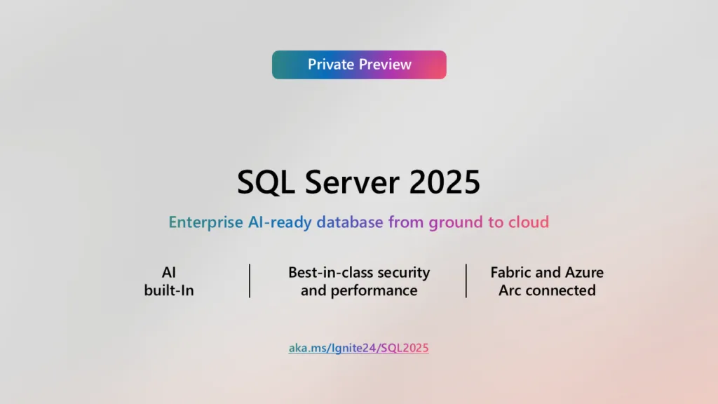
Key Takeaways SQL Server 2025 Introduced: Microsoft’s latest database platform now includes built-in AI capabilities, enhanced query performance, and advanced security features, enabling faster insights and improved data protection. Seamless Azure SQL Integration: Microsoft Fabric now deeply integrates Azure SQL, streamlining data pipelines and eliminating silos for a unified analytics experience. Real-Time Analytics and AI: Businesses can access real-time insights and leverage AI tools directly within their data environments, boosting agility and decision-making speed. Support for Hybrid Cloud: Both SQL Server 2025 and Azure SQL provide seamless connectivity across on-premises, cloud, and hybrid setups, offering flexibility for diverse organisational needs. Unified Data Ecosystem: Microsoft’s updates empower organisations to unify data storage, processing, and analytics, reducing complexity and improving collaboration across teams. Microsoft Launches SQL Server 2025 and Integrates Azure SQL into Microsoft Fabric at Ignite 2024 Microsoft Ignite 2024 showcased several major announcements, including the debut of SQL Server 2025 and the tighter integration of Azure SQL with Microsoft Fabric. These advancements demonstrate Microsoft’s drive to simplify data management and enhance organisational capabilities across on-premises, cloud, and hybrid environments. SQL Server 2025 Delivers Performance and AI Enhancements SQL Server 2025 introduces cutting-edge features that cater to the growing demands of modern businesses. Microsoft packed this latest version with built-in artificial intelligence (AI) capabilities, enabling organisations to analyse data, automate processes, and generate insights faster than ever. Businesses can now rely on AI directly within the database for tasks that previously required external tools. The update also strengthens security. New encryption features and advanced threat detection tools protect sensitive information and ensure compliance with strict data regulations. These enhancements allow companies to safeguard their operations while keeping performance at an all-time high. In addition to security, SQL Server 2025 elevates operational speed. Its optimised query execution reduces latency and handles complex workloads effortlessly, empowering businesses to maintain smooth operations even under pressure. The platform now supports hybrid cloud environments more effectively, allowing seamless connections between on-premises systems and cloud infrastructure without the need for major reconfiguration. Microsoft Fabric Gains Power from Azure SQL Microsoft’s enhanced integration of Azure SQL into Microsoft Fabric transforms the way organisations handle data. Azure SQL, a trusted cloud database platform, now works seamlessly within Fabric’s analytics ecosystem. This deeper integration enables organisations to link their structured data with Fabric’s tools for advanced analytics and machine learning. Microsoft designed this connection to streamline workflows and improve collaboration across teams. Users can feed operational data from Azure SQL directly into Fabric’s real-time analytics tools, eliminating redundant processes and reducing the need for data transfers. This integration also boosts productivity by creating a unified pipeline that connects data storage, processing, and analysis in a single environment. Empowering Businesses with a Unified Data Strategy Microsoft continues to prioritise efficiency and collaboration with these advancements. SQL Server 2025 and Azure SQL within Fabric help businesses eliminate data silos and manage their information in a more cohesive manner. Teams gain access to the tools they need to handle large datasets, develop AI models, and uncover insights without delays or disruptions. These updates also address the challenges posed by hybrid and multi-cloud environments. Organisations can now access consistent tools and features regardless of their infrastructure, allowing them to transition to the cloud or maintain hybrid setups at their own pace. This flexibility ensures that Microsoft’s solutions adapt to diverse business needs and future-proof existing data strategies. Accelerating Business Decisions with Real-Time Insights Microsoft’s announcements reflect the growing demand for real-time analytics and actionable insights. Businesses now have the ability to analyse trends, monitor performance, and make data-driven decisions within moments. SQL Server 2025 and Microsoft Fabric’s integration with Azure SQL ensure that companies gain faster access to meaningful insights, boosting their agility and competitiveness. Microsoft’s approach supports businesses that seek to harness AI for predictive modelling, risk analysis, and trend forecasting. These tools provide a foundation for smarter operations while minimising complexity. Shaping the Future of Data Management SQL Server 2025 and Microsoft Fabric represent more than incremental updates. These innovations signify a shift towards smarter, faster, and more secure data management. By combining SQL Server’s robust database capabilities with Fabric’s analytics tools, Microsoft equips organisations to handle the demands of a data-driven world. Microsoft plans to expand these capabilities further, aligning its offerings with emerging technologies and market demands. SQL Server 2025 ensures businesses have access to reliable, high-performance databases, while Fabric provides advanced analytics to uncover insights and drive growth. Microsoft Delivers Tools for Modern Enterprises Microsoft’s announcements at Ignite 2024 signal its unwavering commitment to empowering businesses. SQL Server 2025 accelerates operations and strengthens security, while Azure SQL’s integration into Fabric connects data silos and creates a cohesive platform for analysis. Businesses of all sizes now possess the tools to modernise their workflows, protect their data, and unlock the potential of real-time analytics. Microsoft’s solutions deliver efficiency without compromise, ensuring every organisation can thrive in a fast-paced, data-centric landscape. Wrap Up Microsoft’s Ignite 2024 announcements mark a turning point in data management and analytics. SQL Server 2025 redefines database performance with AI and hybrid-cloud readiness, while Azure SQL’s integration with Microsoft Fabric unites storage, processing, and analytics into a seamless experience. These updates reflect Microsoft’s vision to empower organisations, simplify operations, and shape the future of data-driven decision-making. With these tools, businesses gain the capabilities they need to innovate, adapt, and excel in an increasingly competitive environment.
How to Connect Power BI to an Excel File on OneDrive or SharePoint

Introduction Trying to connect Power BI to an Excel file stored in OneDrive or SharePoint can cause immense frustration if you don’t know how. The problem often boils down to getting the right URL—just grabbing the link from the browser or using the “Copy Link” unfortunately doesn’t work (if only life were that simple). But don’t worry – I’ll walk you through the exact steps, and by the end of this guide, you’ll finally feel like you can put down the hammer. How To Step 1: Open the File in Excel Desktop Start by opening the Excel file you have stored in Onedrive or Sharepoint that you want to connect to in the desktop version of Excel (this is important—don’t use the online version for this step). Once the file is open, click on the File tab in the top left corner. From the menu, select Info on the left-hand side. This will bring up some details about the file. In the Info section, you’ll see a button labelled Copy Path. It’s typically located at the top left, near the file name. Click this button to copy the file’s full URL to your clipboard. Step 2: Clean Up the URL Once you’ve copied the file path, paste it into a text editor (like Notepad or Word) so you can edit it. The path you’ve copied will look something like this: https://companyname.sharepoint.com/sites/sitename/Shared%20Documents/filename.xlsx?web=1 Notice the part at the end, ?web=1? That’s not helpful for Power BI—it’s meant for a browser preview. Delete ?web=1 so the URL is clean and points directly to the file. After editing, your URL should look like this: https://companyname.sharepoint.com/sites/sitename/Shared%20Documents/filename.xlsx Now you’ve got the correct link. ⚠️ Alert: This step is often the part that catches people out – it’s absolutely essential for the connection to work properly. Make sure you remove the ?web=1 at the end of your file path to ensure Power BI can connect! Step 3: Connect to the File in Power BI Now that you have the proper URL, it’s time to switch over to Power BI. Open Power BI Desktop and head to the Home tab. Click on Get Data (the big button in the top left). From the list of available connectors, select Web. Don’t worry—this works for OneDrive and SharePoint files. A pop-up box will appear asking for the URL. Paste in your cleaned-up file path and click OK. Step 4: Authenticate the Connection At this point, Power BI will ask you to log in to access the file. This is because files stored on OneDrive or SharePoint are protected by your Microsoft 365 credentials. When prompted, choose Organisational Account as the authentication method. Log in using the same credentials you use for OneDrive or SharePoint. If the login is successful, Power BI will connect to the file and retrieve its contents. Step 5: Load or Transform the Data Once connected, Power BI will display a preview of the tables, sheets, or named ranges in your Excel file. Select the Data: Tick the checkboxes for the data you want to use. Transform or Load: If your data needs a bit of cleaning or restructuring, click Transform Data to open Power Query. Here, you can rename columns, filter rows, or merge datasets. If your data is ready to go, just click Load to bring it straight into Power BI. Now you’re ready to start building your visuals and dashboards! Why This Works You might wonder why we have to go through all this instead of just grabbing a link from OneDrive or SharePoint. The reason being, links you get from the “Copy Link” button are designed for sharing, not direct access. They often include parameters like ?web=1 or even tokens that confuse Power BI. By using the Copy Path button in Excel Desktop, you get the file URL Power BI needs (albeit with a small adjustment required as outlined above). Pro Tips for a Smooth Experience Keep the File Path Consistent: Once you’ve connected Power BI to your file, avoid moving or renaming it in OneDrive or SharePoint. Doing so will break the connection, and you’ll have to reconnect. Scheduled Refresh: If you’re publishing your report to Power BI Service, remember to set up your credentials in the dataset settings to enable scheduled refreshes. This way, your data stays up-to-date without manual effort. Verify Permissions: Make sure your account has the necessary permissions to access the file. If someone else shared the file with you, ensure you’ve been granted edit or view permissions. Use Named Ranges: If your Excel file has multiple sheets or messy data, consider using named ranges. These make it easier to connect directly to the specific data you need. And That’s It! Hopefully you’re now able to connect to the spreadsheet that’s been causing you frustration stored on OneDrive or SharePoint. With this setup, your reports can stay connected to live data that is centralised, making updating the report easier for anyone that has the required access. Hope this helps!
Beginners Guide to Power BI: Part Two – Connecting to Various Data Sources

Welcome back to our Power BI series! In Part One – Getting Started, we dipped our toes into the world of Microsoft Power BI, exploring its capabilities as a business intelligence tool. If you’re just joining us, I recommend checking out the first part to get the basics of Power BI. Today, we’re going to tackle a fundamental aspect of Power BI: connecting to various data sources. Understanding data connections is crucial for any beginner looking to master Power BI. We’ll explore the different connection types available, discuss how to choose the right one for your needs, and then walk through how to connect to an Excel file using Power BI Desktop. So, grab a cup of coffee, it’s time to switch your brain on! Understanding Data Connections in Power BI Before we get into the how-to, let’s talk about why data connections matter. Power BI is all about turning raw data into meaningful insights through compelling data visualisations and interactive dashboards. To do that, you need to bring data into Power BI from somewhere (obviously), and that’s where data connections come in. Why Connecting to Data Sources Matters Power BI enables users to access, transform, and analyse data from a hundreds of different sources. Whether you’re pulling data from an Excel spreadsheet, a cloud service, or an on-premises database, the ability to connect to almost any and all of these sources is what makes Power BI such a powerful business intelligence tool. Types of Data Connections In Power BI, you have several ways to connect to your data sources. The main connection types are: Import Mode DirectQuery Live Connection Composite Models Let’s break down each one. Import Mode Import Mode is the most common way to connect to data in Power BI. When you use this mode, Power BI imports a copy of the data into your Power BI Desktop file (also known as a .pbix file). This mode is great for datasets that aren’t too large and when you need high performance. Advantages: Fast performance when creating visualisations and reports. Full functionality of Power BI features like DAX formulas and data modelling in Power BI. Considerations: Data can become outdated; you need to refresh to get the latest data. Larger datasets can make the file size big and impact performance. DirectQuery With DirectQuery, Power BI doesn’t store the data in the .pbix file. Instead, it queries the data source each time you interact with a visual. This is useful when dealing with large datasets or when you need real-time data. Advantages: Access to up-to-date data without manual refreshes. Handles large datasets without bloating your file size. Considerations: May have performance issues due to constant querying (both on the report and/or it’s data source). Limited functionality compared to Import Mode; some DAX functions aren’t available Live Connection Live Connection is similar to DirectQuery but is primarily used with SQL Server Analysis Services and Power BI datasets. It allows you to connect to a pre-existing data model without importing or querying the data, so many reports can use the same base data model for reporting and calculation. Advantages: Centralised data models ensure consistency across reports. No data storage in the .pbix file. Considerations: Can’t create new data models or add new data sources in Power BI Desktop. Relies on the data model created by your data team. Composite Models Composite Models combine Import Mode and DirectQuery in one model. This gives you flexibility, allowing you to choose the best connection type for different tables within the same model. Advantages: Flexibility to optimise performance and functionality. Ability to use imported data for small tables and DirectQuery for large ones. Considerations: Can add complexity to your data model. Some limitations on relationships between tables. Choosing the Right Connection Type So, how do you decide which connection type to use? Here are some factors to consider: Data Size: If you’re working with large datasets, DirectQuery or Live Connection might be better. Performance Needs: For the best performance, especially when creating complex visualisations, Import Mode is ideal. Real-Time Data Requirements: If you need real-time or near-real-time data, DirectQuery or Live Connection is the way to go. Functionality: Import Mode offers the full suite of Power BI features, including all DAX functions and data modelling capabilities. Data Security and Governance: Consider your organisation’s policies. DirectQuery and Live Connection keep data in the source system, which might be required for compliance reasons. Understanding these connection types and when to use them is fundamental to effective data analysis in Power BI. Connecting to Excel Using Power BI Desktop Now that we’ve covered some of the theory-based knowledge, let’s get our hands dirty and connect to an Excel file using Power BI Desktop. This is a common scenario for many beginners and is a great way to start building your Power BI skills. Step 1: Open Power BI Desktop If you haven’t already, download Power BI Desktop from the Microsoft website. Once installed, open the application. Step 2: Get Data On the Home ribbon, click on the “Get Data” button. A dropdown will appear with the most common data sources. Step 3: Choose Excel as Your Data Source From the dropdown, select “Excel”. If you don’t see it immediately, click on “More…” to see the full list of data connectors available in Power BI. Step 4: Navigate to Your Excel File A file browser window will open. Navigate to the location where your Excel file is stored, select it, and click “Open”. Step 5: Select Data from the Navigator Window After opening your Excel file, the Navigator window will appear. Here, you’ll see a list of sheets and tables available in your Excel file. Select the Tables or Sheets: Check the boxes next to the tables or sheets you want to import. Preview the Data: When you select a table, a preview will appear on the right side. This helps ensure you’re selecting the correct data. Step 6: Transform Data with Power Query You
Recover from Spreadsheet Chaos the Right Way

The Wake-Up Call Content warning: this post contains strong opinions about Excel dependencies Look, I’ll be honest – I’m tired of seeing good companies shoot themselves in the foot with terrible data practices. Just last week, I sat across from yet another CEO who pulled out a USB stick containing their “monthly reports.” I tried not to visibly cringe. Breaking Down the Problem After ten years in the trenches of corporate data transformation, I’ve developed a bit of a sixth sense for these situations. The moment I see someone juggling multiple Excel windows while muttering about “reconciling the numbers,” I know we’re in for a ride. That company I mentioned? Their finance director was spending three days each month manually copying data between systems. Three. Whole. Days. When she told me this, I had to take a deep breath before responding. Getting Real About Solutions Here’s the thing – I’m not here to sell you a magical fix. But I do want to share what actually works, based on real projects I’ve led. Step 1: Stop the Bleeding First thing we did was implement basic data integration tools. Nothing fancy – just enough to stop that poor finance director from losing her mind every month. The relief on her face when we showed her how automated data flows work was worth every minute spent on the project. Step 2: Build the Foundation You can’t build a house on sand, and you can’t build reliable business intelligence on dodgy data. We spent serious time on: The Tech Stack That Actually Worked I won’t bore you with every tool we used, but here are the game-changers: Power BI turned out to be a lifesaver – not because it’s perfect, but because it’s good enough and people actually used it. We dabbled with Azure Data Factory for the heavy lifting behind the scenes. Quick aside: If I see one more LinkedIn post about another “revolutionary AI-powered data lake solution,” I might scream. Sometimes simple is better. The Human Side Let me tell you about Sarah from accounting (not her real name). She’d been doing the same manual reports for eight years. EIGHT YEARS. When we showed her how to use the new dashboards, she actually cried. Happy tears, thankfully. Training Matters (More Than You Think) We’ve learned the hard way that fancy tools mean nothing if people hate using them. That’s why we now insist on proper training programs. Not those soul-crushing day-long sessions – we do bite-sized modules that actually stick. Looking Forward Want to know what keeps me up at night? It’s not the latest tech – it’s watching businesses ignore the basics while chasing shiny objects. Yes, data lakes are cool. But can you trust your sales numbers first? What’s Actually Next I’m genuinely excited about some new developments: But here’s my controversial take: most companies need to master the basics before jumping into advanced analytics. I’ve said this to many customers when discussing their data strategy and gotten some dirty looks, but I stand by it. The Bottom Line After all these years helping businesses with their data strategies, I’ve learned one crucial thing: success isn’t about having the fanciest tools. It’s about having the right tools, used the right way, by people who actually understand them. If you’re drowning in spreadsheets right now, know that there’s hope. Just please, for the love of all things data, don’t try to fix everything at once. Start small, build foundations, and grow from there. P.S. If you’re still running your business on Excel sheets stored on USB drives, we need to talk. My contact details are below, and the first consultation is on me – if only so I can sleep better knowing there’s one less USB-based reporting system in the world.
Confused About Licensing? Introducing Our New Power BI & Microsoft Fabric Pricing Estimator

Knowing where to start when embarking on your Power BI or Microsoft Fabric journey can be a real challenge for the uninitiated. With so much to learn around the use of the tools and the configuration, figuring out which licenses you need and the potential costs shouldn’t add to your headaches. That’s why I’m thrilled to introduce our brand-new, free-to-use Power BI & Microsoft Fabric Pricing Estimator. At Easy Insight, we built this tool to set you on the right path when making your licensing decisions, hopefully removing some of the mystery and complexity. The Complexity of Power BI & Microsoft Fabric Pricing Let’s be honest—Microsoft Power BI is amazing for data visualisation and business intelligence, and Microsoft Fabric takes it a step further with advanced analytics. But with all these great features comes a complex pricing structure. Here’s why it can be so tricky: Multiple Subscription Plans: We have Power BI Pro, Power BI Premium per User, and now Microsoft Fabric to take the place of Power BI Premium Capacity (not to be confused with Premium per User), each with its own pricing model. Different User Types and Licensing: Not everyone in your team needs the same license, which complicates things further. Data Volume and Features: Need Co-Pilot? Data Lakehouse? More storage Needed? Need to refresh your data 48 times a day? You may need all or none of the above. This will almost certainly impact on your licensing requirements. Regional Pricing: Costs can vary depending on where your business is located, adding another layer of complexity for global teams. All these factors make it tough to get a clear picture of what you’re likely to spend, especially when you’re planning for growth or working within a tight budget. Introducing Our New Power BI & Microsoft Fabric Pricing Estimator To tackle these challenges, we created the Power BI & Microsoft Fabric Pricing Estimator. This tool is all about giving you a transparent and personalised cost estimate, by taking you step-by-step through a few questions to get a better understanding of what your business needs. Whether you’re a small business just getting started with Power BI or a large enterprise diving into Microsoft Fabric’s advanced features, our estimator adjusts to your specific needs, making sure you know exactly where your money is going. How the Pricing Estimator Works Using our Pricing Estimator is super simple and takes just a few clicks. Here’s how it works: Enter Your Organisation’s Details: Number of Users: Let us know how many people need access and what type of licenses they require (e.g., Power BI Pro, Premium). Data Usage: Estimate your data consumption to ensure you have the right storage and processing capabilities. Licensing Preferences: Choose between different licensing options like Pay-As-You-Go or committing to a 12-month plan. Regional Preferences: Select your operating region (e.g., UK or US) to account for any regional pricing differences. Generate Your Estimate: Once you’ve filled in your details, the estimator crunches the numbers and provides a detailed breakdown of your expected monthly and yearly costs. Review and Adjust: Take a look at your estimate and tweak the inputs if you want to explore different scenarios or optimize your budget further. It’s that simple! Answer a few questions and we’ll provide you with our licensing recommendation and the associated costs. Current Coverage Right now, our Pricing Estimator covers US and UK pricing. We’re continuously working to expand our tool to include more regions, but we need your help! Let us know in the comments which regions you’d like us to add next. Your feedback is invaluable in ensuring our tool meets the needs of businesses like yours around the globe. Together, we can make the Pricing Estimator even more comprehensive and useful for everyone. Get Started Today: Try the Pricing Estimator Don’t let licensing complexities hold your organisation back from harnessing the full potential of Power BI and Microsoft Fabric. Our Power BI & Microsoft Fabric Pricing Estimator is ready to assist you in making strategic, informed decisions that align with your business intelligence needs. Here’s how to get started: Visit Our Pricing Estimator Page: Access the tool through our website by clicking here. Enter Your Details: Provide the necessary information about your organisation’s users, data usage, licensing preferences, and region. Review Your Estimate: Receive a detailed cost breakdown and explore different licensing scenarios to find the best fit for your budget. Take Action: Use the information gained to start your Power BI/Fabric journey, or if you still need help reach out to our team for further assistance. Empower Your Business Intelligence Journey We hope that our Power BI & Microsoft Fabric Pricing Estimator provides you with the tools and knowledge needed to make informed, cost-effective licensing decisions. By simplifying the complexities of licensing and pricing, we hope to empower more businesses to take their first step with the BI tools that we believe can be invaluable any business. Ready to take the next step? Try our Pricing Estimator today, and remember, if you need personalised support or guidance, the Easy Insight team is here to help! FAQ Do I need to sign up for a newsletter or marketing updates to use the Pricing Estimator? Nope! You can use our Power BI & Microsoft Fabric Pricing Estimator without signing up for any newsletters or marketing communications. We believe in making our tools accessible and hassle-free. However, if you’re interested in staying updated with the latest tips, updates, and exclusive offers from Easy Insight, you’re always welcome to subscribe! Will you keep or store my data after I use the estimator? Your privacy is important to us. We do not store any of the data you input into the Pricing Estimator. Once you receive your estimate, all the information you provided is securely deleted from our servers. Feel confident knowing your data remains private and is not used for any other purposes. Is the Pricing Estimator free to use? Yes, absolutely! Our Pricing
Beginners Guide to Power BI: Part One – Getting Started

Have you ever felt overwhelmed by endless rows and columns of data in Excel spreadsheets? You’re not alone. According to the 2024 UK Business Data Survey, nearly 99% of UK businesses handle digitised data, yet only a small portion effectively transform that data into actionable insights. With so much information at their fingertips, why are so many businesses struggling to unlock its true potential? The answer might be simpler than you think—they haven’t yet found the right tool for the job. That’s where Microsoft Power BI comes in. This powerful business intelligence tool enables users to access, analyse, and visualise data like never before. To get you up and running with Power BI, we have created a seven-part beginners guide. In this guide, we’ll explore the basics of Power BI, helping you transform raw data into actionable insights. Here’s what we’ll cover in the upcoming parts: Part Two – Connecting to Various Data Sources Part Three – Transforming Data with Power Query Part Four – Building Data Models in Power BI Part Five – Creating Visualisations and Dashboards Part Six – Diving into DAX Formulas for Advanced Analytics Part Seven – Sharing and Collaborating with Power BI Service But first, let’s get started with understanding what Power BI is and why it’s a game-changer in the field of data analytics. What Is Power BI? Power BI is a suite of business analytics tools by Microsoft that allows you to connect to various data sources, transform raw data, and create interactive reports and dashboards. It’s designed to empower everyone—from data analysts to business users—to make informed decisions based on real-time data. Key Components of Power BI Power BI Desktop: A Windows application used for creating reports and data visualisations. Power BI Service: An online SaaS (Software as a Service) platform where you can share reports and dashboards. Power BI Mobile Apps: Access and interact with your data on iOS, Android, and Windows devices. Why Use Power BI? Power BI Is a Powerful Business Intelligence Tool User-Friendly Interface: Even if you’re new to data analysis, Power BI’s intuitive design makes it easy to learn the basics. Integration with Microsoft Products: Seamlessly integrates with Excel, Azure, and other Microsoft services. Scalable and Flexible: Whether you’re a small business or a large enterprise, Power BI is scalable to meet your needs. Custom Visuals: Download custom visuals from Microsoft to enhance your reports. Real-Time Data Access: Connect to live data sources for up-to-the-minute analytics. Power BI Lets Users Transform Data into Insights With Power BI, you can: Import Data: Connect to hundreds of data sources, both cloud-based and on-premises data. Transform Data: Use Power Query to clean and prepare your data. Create Data Models: Build relationships between tables in your data model. Design Visualisations: Craft interactive visuals to represent your data effectively. Share Reports and Dashboards: Collaborate with team members using Power BI Service. Download Power BI Desktop Getting Started with Power BI Desktop To begin your journey, you’ll need to download Power BI Desktop. Here’s how: Visit the Official Website: Go to the Microsoft Power BI Download website. Select your Preferred Language: Select your preferred language from the dropdown menu, then click the download button. Install: Run the installer and follow the on-screen instructions. Learn the Basics of Power BI Desktop Once installed, Power BI Desktop serves as your primary tool for data analysis and report creation. It combines data exploration, modeling, and visualisation in one place. This unified approach simplifies the data analysis process, allowing you to focus on extracting insights rather than wrestling with multiple tools. Understanding the Power BI Interface When you load Power BI for the first time, some parts of the interface may look familiar if you’re used to Office 365 products, while other parts may not. Let’s walk through the key components of the interface: The Ribbon (Red Box) Located at the top, the Ribbon provides quick access to common tasks: Home Tab: Import data, transform data, and create new visuals. Insert Tab: Insert visualisations and other objects, such as text boxes and shapes. View Tab: Adjust the appearance of your workspace and edit or select a new report theme. Modeling Tab: Manage relationships and create DAX formulas or new parameters. The Canvas (Green Box) This is your workspace where you’ll build reports and dashboards. You can drag and drop fields to create visualisations, arrange them, and customise their appearance. The Pane Selection Menu (Orange Box) Recently added to Power BI Desktop’s Interface, this menu lets you open and close the various side-panes available: The Data Pane The Data Pane displays all the tables and fields in your dataset. You’ll use this to select data for your visualisations, ensuring you have access to all the necessary information for your analysis. The Build a Visual Pane This pane lets you choose and customise various data visualisations. From basic charts to advanced graphs, the Build a Visual Pane offers a variety of options to represent your data effectively. The Format Pane The Format Pane allows you to customise the appearance of your visualisations. From adding borders and changing background colours to applying conditional formatting, it offers a wide range of options to enhance the look and feel of your visuals. The Selection Pane The Selection Pane helps you manage the visibility and order of objects on your report page. You can hide or show visuals, group items, and control the layering of objects. This is useful when working with overlapping elements or creating dynamic reports where certain visuals need to be hidden or displayed based on user interactions. Connecting to Data Sources Use Power BI to Connect to Various Data Sources Power BI offers a wide array of data connectors that allow you to import data from different sources: Excel Files: Import data directly from your spreadsheets. SQL Databases: Connect to your company’s databases for real-time data. Cloud Services: Access data from Azure, Salesforce, and other cloud platforms. Web Pages: Scrape data from websites for analysis. On-Premises Data Sources: